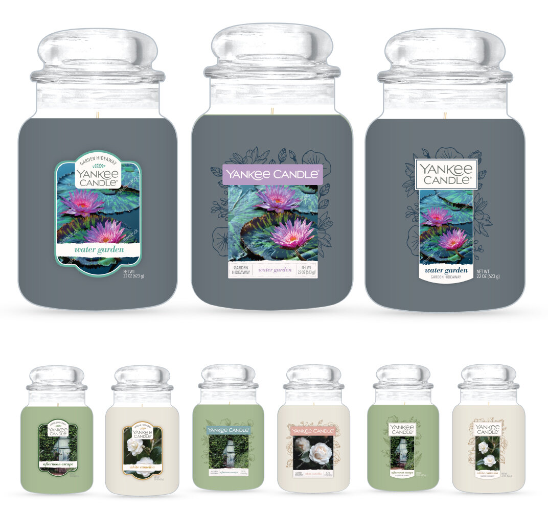
Garden Hideaway Collection
Yankee Candle’s Spring 2020 Garden Hideaway Collection
The Garden Hideaway Collection is inspired by nature—full of lush florals, fruit, and herbs. This hidden garden is tucked away and filled with fragrances, flavors, sights we sometime miss with our busy lives. I wanted to design a label that felt delicate, beautiful, and reminded others to indulge in life’s peaceful moments.
This project was my first individually led project at Newell, and the first time our team worked with clear labels. This made for a learning experience with our vendors and team. The labels all share the same plates to keep costs low and to tie them all together as one collection.
Collection Theme
The brand team had asked us to explore a range of concepts, but asked us to not stray too far from our core label lockup. They shared a few past collection examples with us and where they fit in relation with our core label. They asked us to create concepts that fell within the subtle to bold nod to theme.
Moodboard
After learning more about the Garden Hideaway collection, our team provided a few moldboards that we felt aligned with the overall theme and vision. We loved the idea of hand drawn botanical illustrations, ripped cotton paper, muted color palettes, touches of foil, and bold serif fonts.
Round One Concepts
For round one, our team presented concepts that were a bold nod to the theme. We shared concepts with different types of illustration styles and different ways to incorporate the ripped paper. The brand team thought these first concepts were beautiful, but asked us to add back in the photography.
Round Two Concepts
For round two, our team presented 3 different concepts—all which included photography. The first concept we wanted the frame to symbolize a seed packet. The second and third concepts were similar, with minor differences in: color, width, and the copy lock up. The team narrowed in on the third concept with a few minor tweaks.


