Hope House
A faith based, nonprofit, outreach ministry in Big Rapids, MI
Originally, Hope House approached Rachel and I wanting an easily manageable website. After doing research we quickly realized Hope House was lacking a brand system and wanted to help. We decided they would benefit from a new strong brand presence across different media types.
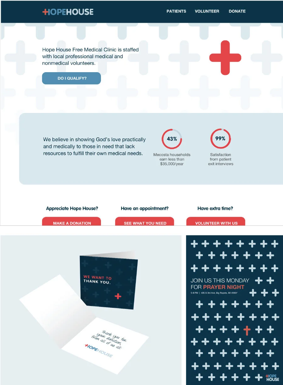
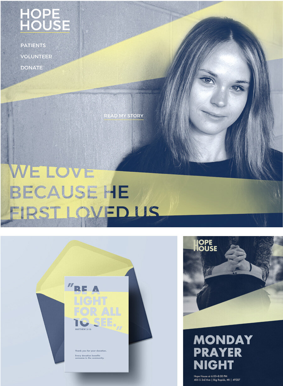
I collaborated with Rachel to create an entirely new brand system for Hope House. We produced: business cards, letterheads, thank you cards, banners, an outdoor sign, brochures, t-shirts, a functional website, and a brand standard booklet all while staying under their budget of around $1,000.
Patients
50/50 male and female
Most, if not all, have phones
60% have internet at home
They want to receive quality medical care with no bills
Want to be able to make and cancel appointments easily
Be guided to take steps forward in their life
Doctors
Consist of doctors, spiritual guides, receptionists, etc.
Some were past patients
Want to use their talents to give back to the community
They help patients better their situations and lives
They get involved to raise money for medical costs
Donors
Want to learn about what Hope House does
They want to know what their money is being used for
Want to see compelling, relatable, and personal stories
Need options for donating

Existing User Experience
The Hope House existing user experience is built off questions that potential patients have asked. Patients are very hesitant while finding information about Hope House because there are a lack of reliable sources (no website or Facebook.)

Desired User Experience
The desired user experience is created by filling gaps found in the existing user experience. The gray icons represent existing touch points within Hope House while the blue represents new touch points that have been implemented.
Logo Exploration
The final goal for the logo was to create an abstract representation of a house and a medical center. There were over 100 variations before coming to the final logo.
Network of Help
Network of help recognizes the connections and partnerships Hope House has within the community. The goal of this concept is to feel straight forward, clear, informative, and clever. There is a play on the medical symbol and a cross, to show the religious side of Hope House.
Light the Path
Light the path recognizes the religious side of Hope House. The goal of this concept is to feel compassionate, emotional, inspiring, and supportive. This concept uses light to highlight important elements for each touch point.

A Friend in Need, is a Friend Indeed
A friend in need, is a friend indeed recognizes the friendly and nonjudgmental side of Hope House. The Hope House board mentioned how they show love to everyone no matter their struggle, appearance, or lifestyle. This is the concept that the Hope House board members chose, before we made updates.

Business Cards and Hope House Volunteer T-Shirts

Letterhead and Thank you Card with Branded Envelopes

Patient Brochure

Site Map

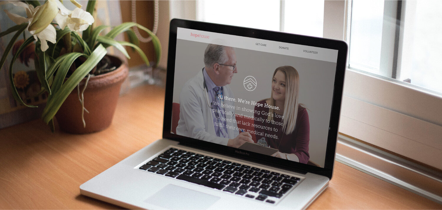
Hope House Website
The Hope House website is the main source of information for patients, donors, and volunteers. The user is greeted with a bright image, a friendly message, and clear navigation.

Brand Standards
We left the Hope House team with a system of guidelines and standards that they could follow to create other materials if needed.