Nature’s Wick
Refreshing Nature’s Wick Candle Line
Nature’s Wick, a sub brand of Woodwick, previously had a large business exclusively with Target in the US. The brand team wanted to open up the distribution to new customers in the US and asked the design team to update the brand, which hasn’t changed in years.
I individually lead this rebrand, which included: an updated logo, label, and lid labels. I also had the labels switch to a “Tree Free” environmentally friendly label (vs the original plastic) so that it aligned closer to the Nature’s Wick brand standards.
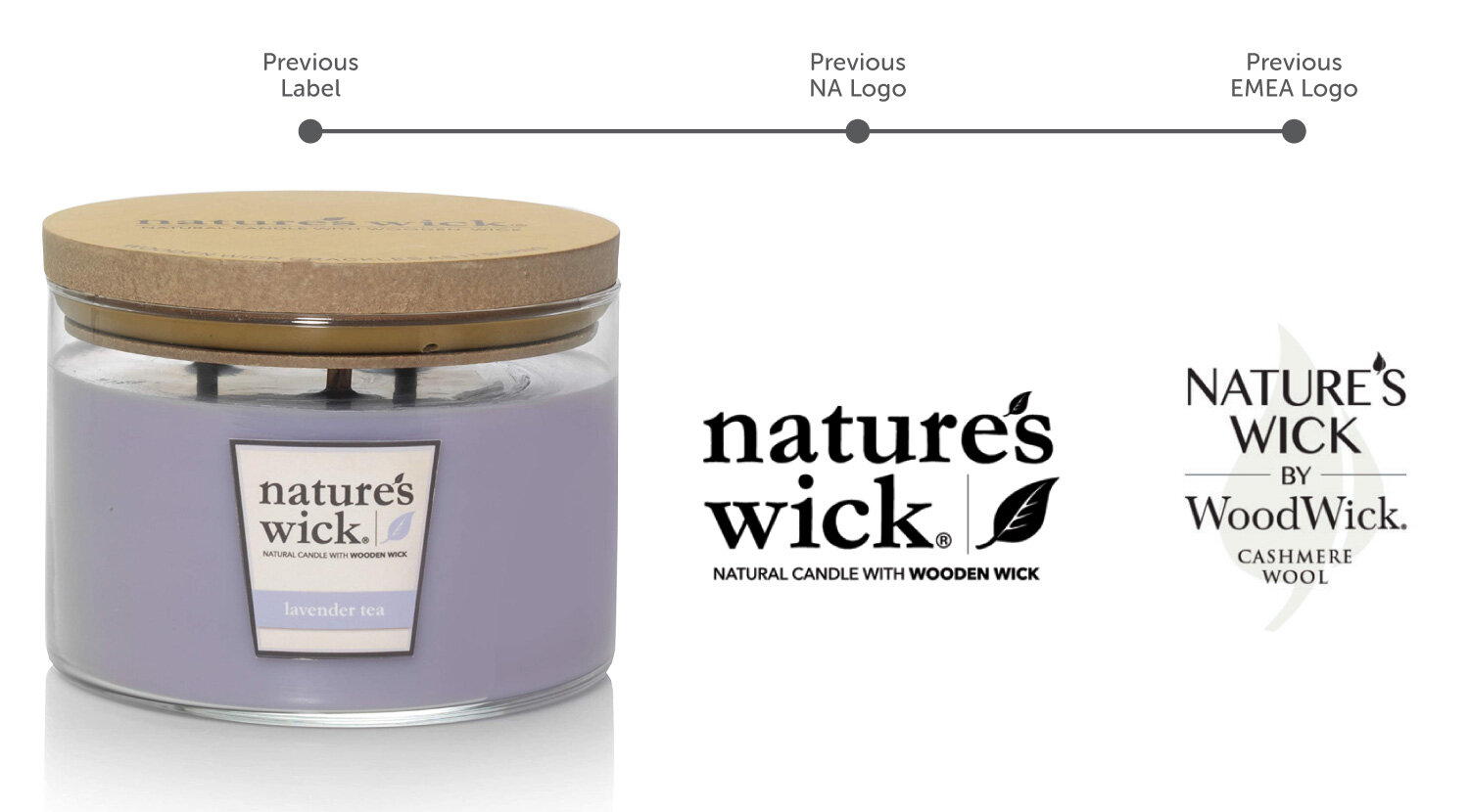
Exisiting Logos
Nature’s Wick previously had two different logos, one used in North America and the other used in Europe, Middle East and Africa (EMEA.) We wanted to created one universal logo that was more modern and clean.
Logo Exploration
I explored many different logo types: lettermarks, wordmarks, and combination marks. I wanted to explore options that were close to the existing logo and ones that were very different. The brand team decided on a logo that was closer in to what was existing.

Label Exploration
I explored different materials, finishes, styles and sizes for the labels. Because of the tapered candle vessel, we had to work around a label size that wouldn’t become warped or peel off easily. A square, slightly rectangular, shaped label became the best solution for the tapered jar. We decided to steer away from foil and other premium looking labels, so that Nature’s Wick wouldn’t compete with Woodwick, a higher price point sub brand.

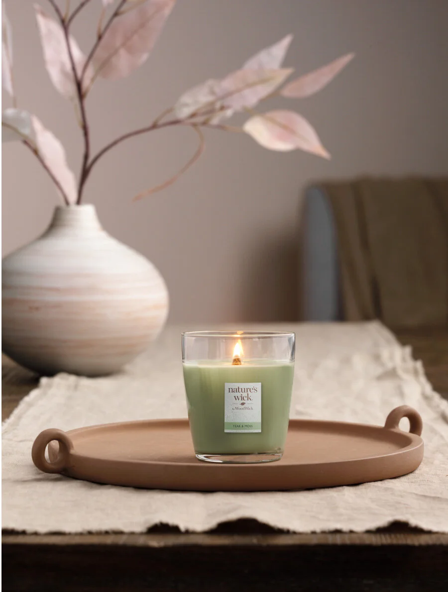
The Final Logo & Label
We landed on a tree free, environmentally friendly, label. The square shape insured no warping or peeling would happen on the tapered jar. We introduced the updated modernized logo at the top of the label, with a subtle organic leaf illustration peaking from the bottom. The Fragrance name is clearly shown at the bottom of the label with a corresponding color.